People are drawn to great spaces. Exterior or interior, urban or suburban, some spaces are just magnets for gathering and the eternal sport of watching life’s rich pageant unfold. There are so many examples around the world—from Piazza San Marco in Venice and Rockefeller Center in Manhattan to Milan’s Galleria or the Burj Al Arab in Dubai—that making the point seems almost unnecessary. Exactly why people are drawn to these places, however, has vexed architects and designers for centuries.
Like explaining fine wine, it’s hard to define precisely what goes into a great space. But we tend to know it when we see it. There is a “sense of place” or that intangible feeling of comfort and belonging. There is a civic element or the notion that you are among a community of like-minded people with a shared ethos or social purpose. There is of course a human component, to seeing and being seen. Not to mention a sense of scale, created through both large gestures (a soaring skylight) and small ones (a comfortable place to sit). There are elements that encourage lingering and moving along. And there is a sense that something wonderful is about to happen here, right here, at any given time.

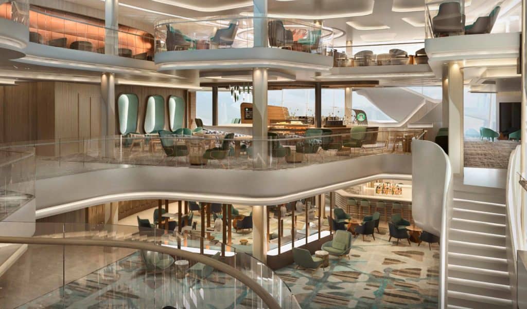
The atrium is a multi-layered space with places to see and be seen as well as quieter, more intimate areas to enjoy a cup of coffee and prepare for the day ahead.
Creating a place that checks all these boxes is no small feat. But this is exactly the thought process Studio DADO brought to the design of the Penrose Atrium on Norwegian Cruise Line’s new Prima class ship—how do we create a space that draws people without relying on a specific attraction? At the core of this approach is thinking about the ship as, well, not a ship. Instead, we wanted to place the guest at the center of the equation and mint the emotional currency needed to engage or inspire that guest, capturing all those attributes that make a great space great. How did we achieve that? Once the guest experience becomes the guiding force, the rest tends to fall into place.
We started with research, including visits to key sites and precedents, and conducted an almost forensic dissection of each space: such details as proportion, scale, height, capacity, and volume were recorded and analyzed. The research was dutifully compiled and collated and used as a road map for the design. We were so deliberate in the data we harvested, that the client often referred to us as “The Professors.” But our intent was to identify what we could borrow from other great spaces. What mistakes could we avoid? And what strengths could we build on?
We didn’t want to reinvent the wheel. At the same time, no one had ever attempted an atrium of this complexity in the center of a ship before. But the design brief called for a re-defined guest experience, an elevated level of design and spaces that would surpass anything on land. NCL was looking for next-generation ideas and not just a variation on a theme. As the designer of dozens of the ship’s venues and guest suites, we knew the bar had to be high.

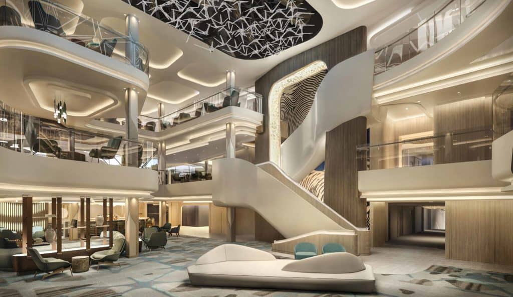
The space is a symphony of organic, curved lines and overlapping planes. The art wall flanking the stair suggests nautical navigation, while the ceiling piece feels like twinkling constellations. The architecture is unabashedly modern as if the space were a sign of what a cruise will look and feel like in the future.
While we practice a truly collaborative approach to design here at Studio DADO, much of the props have to go to Zack Niphatkosalsilp, a DADO designer who manages to combine his background in architecture and urban planning to create spaces that truly inspire. Zack “visualized” it from the beginning and it’s the clarity of his expression that helped us convince the client this was the way to go.
Removing decks and pillars, dealing with the incessant vibration and motion, not to mention integrating a grand sculptural stair, potentially compromises the structural integrity of the vessel exactly where it is needed most. Why would anyone attempt that? And this is where the technical prowess of Fincantieri blends with the design strength of DADO, a compelling cocktail of innovation, aesthetics, and technology.
“No one had ever attempted an atrium of this complexity in the center of a ship before. But the design brief called for a re-defined guest experience and an elevated level of design … We knew the bar had to be high.”
The atrium is a three-level (decks 6, 7 and 8), an interconnected node within the ship. The architecture is unabashedly modern, almost futuristic, and relies on a series of flowing, organic shapes that draw the eye in and around the space. Like some of the famous locations mentioned above, there is a dramatic sense of arrival as the circulation moves in and out of the main space but also passes through a textured portal and grand stair. The portal, which encases a piece of custom art reminiscent of a nautical chart, helps orient guests and defines the scale of the space.

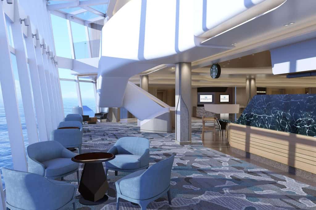
A glass wall leans outward, creating the illusion the guest is almost floating above the water. We consciously blurred the line between the outside and inside to create the ideal place to watch a sunset or a moon rise over the water.
The retailers that line the three floors activate the space across the day and evening, offering guests the opportunity to window shop, meander or enjoy a cup of coffee as they greet the sun rising over the horizon. But the space also has an inherent flexibility to it. Like a public square, it can be “programmed” for events or small gatherings.
The starboard edge is floor-to-ceiling glazing, meaning guests have absolutely no doubt what the main event is—the view. But here, too, the emphasis is on the guest, who is given the opportunity to define the experience as an active one (gathering with friends, say) or a passive one (sitting and chilling).
The levels form overlapping planes and accentuate the three-dimensional quality of the space, creating sight lines across the void, from level to level, zone to zone. This, and a variety of seating options, give guests a variety of “perches” to chat, people watch, or just sit, relax and catch up on emails.
The atrium ceiling features a dynamic light fixture, a custom piece by the Czech designer Lasvit that suggests the stars in a summer’s night sky—a million points of light that can be programmed to elicit different lighting moods or atmospheric effects.

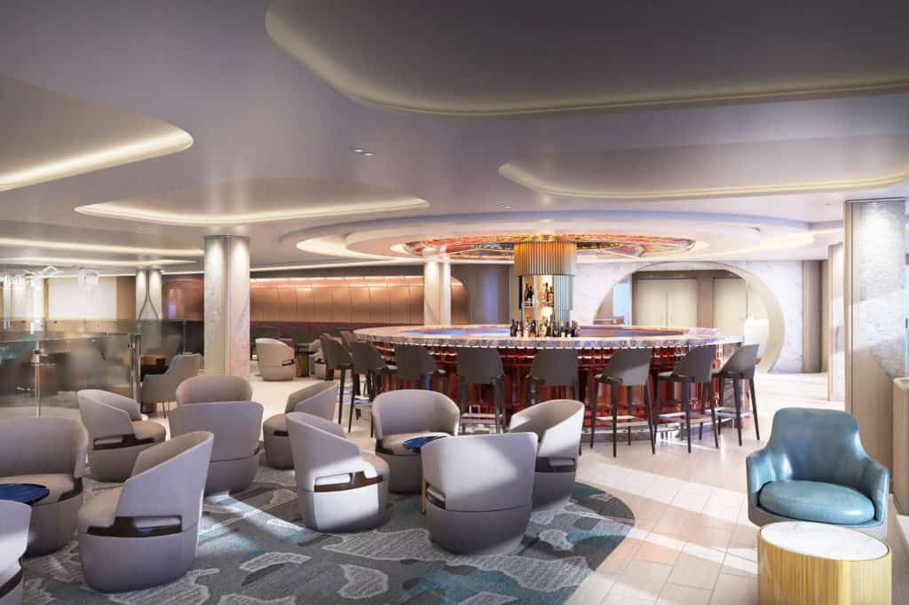
The uppermost deck of the atrium sports a casual whiskey bar—the perfect spot for that always-necessary nightcap after a pleasant day aboard Prima.
We know that traveler expectations are changing, and that hospitality brands and cruise lines are evolving right alongside them. The cliché is that it would take ‘outside the box’ thinking to create the Penrose Atrium. But our approach was more fundamental: there is no box. For the latest group of guests looking for new experiences, the standard rules of design may no longer be valid. That applies equally to guest suites and staterooms as it does to grand spaces like the atrium. (As seen here in D+C Magazine)
And here at Studio DADO, we can’t wait to see these new standards take the entire industry to an even higher level of design and creativity.
For a deeper look into the aesthetic behind the DADO-designed spaces onboard Norwegian Prima, see DADO Partners Greg Walton, Yohandel Ruiz, Jorge Mesa, and Javier Calle in this episode of NCL’s Behind the F1rsts.